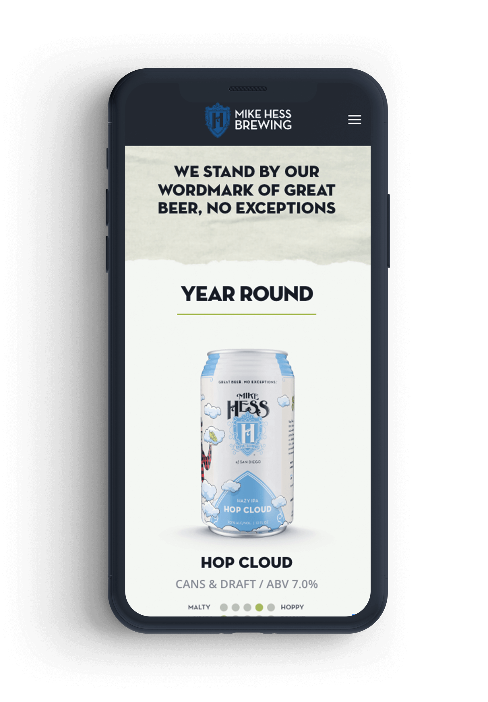
With the success of Hop Cloud IPA, a character driven can design, they needed all new can designs that focused on individual characters that could be expanded for other marketing efforts. Each beer needed to have both unique artwork and visual consistency.


The end result was a series of unique illustrations worked into a structured template that allowed for artwork to interact with the other elements on the label.
Working with 2 illustrators, original concept sketches were then developed into custom vector artwork.
The concept behind each character was grounded in beach life to align with Mike Hess Brewing. The characters also had environmental elements that were placed behind and in-front of the standardized elements in the template. The success of the can designs were the balance of individual can uniqueness and visual consistency.


This brewing company needed a website with functional CMS and a design for rotating featured beer as well as a finder menu with filterable search fields. Each location page also featured an edited clip showing the location with drone footage.